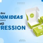
Your chances of grabbing a growing consumer are slim. After seeing what’s happening in stores and online and what customers are looking for, we will discuss some packaging trends that take flight in 2023. Some may seem obvious, and some may surprise you, but a lot is happening in the packaging design world. Consumers want packaging that conveys a sense of calm. Many examples of muted, complementary shades with minimal fonts offer linear content and simplicity. While on the other hand, some prefer bold and confident.
Packaging Trends to Take into 2023
Without waiting any further, let’s start. Below are some of the trendiest designs for your amazing good.
Minimalism
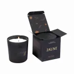
It’s easy to understand the appeal of minimalism to large audiences. A simple package has two advantages. They are giving the product an appealing simplicity and honesty and ensuring that it remains clean and sophisticated. Minimalist packaging is becoming increasingly popular, especially in cosmetics and beauty. Many popular companies have introduced minimal packaging designs. Following the popular brands, more brands are quickly following suit. As such, minimalism is expected to increase in popularity in 2023. Today, minimalism is returning thanks to efforts to pursue simplicity, making consumers feel like they have nothing to hide in their business. The neat packaging adds a touch of sophistication with clean lines and lets the quality of the product do the job rather than relying on gimmicks.
Color Blocking
Layering and mixing blocks of different colors have been popular for some time. Still, in the past few months, designers have left straight lines and rigid shapes behind. Now more organic and soft designs dominate packaging. Companies now make their packaging look more natural and approachable, reminding consumers of familiar elements found in nature. Combined with bolder tones, it presents a unique opportunity to establish a brand identity that is friendly, earthy, and cheerful.
Transparent Packaging
Transparency in windows and product packaging has been part of the packaging industry for decades and is a common design element used in food packaging design. However, the demand for ingredient transparency, minimalist design trends, and customized packaging innovation need to be more transparent. The advantage of this design is that it allows consumers to get a glimpse of what they are getting before purchasing it, thus making it desirable.
Earthy Colors
In addition to not using environmentally harmful plastics, many brands continue the eco-trend with natural, earthy colors. This has become very common. Recently, however, brands outside the organic market have also started to capitalize on the sustainability movement by using natural colors. Organic products have used this color palette for years and are considered healthy and natural. It has become synonymous with desaturated colors such as browns, blues, and greens are used to highlight sustainable product packaging and the brand’s commitment to the planet.
Typography
In recent years, typography has experienced a meteoric resurgence in the design industry as a means of visual communication. Now that type of designer can be more ambitious with their creations. Companies can use bold, distinctive lettering to differentiate their products from competitors. Effective packaging design can be achieved through typography, including repetition, unique composition, and engaging language. Designs that emphasize letters are popular. The style recognizes the complexity of typeface design and celebrates it as an art form in its own right. No photos or illustrations are used. Instead, a striking font takes center stage, utilizing bold color contrasts. The move challenges popular beliefs about typography that prioritize aesthetics over legibility.
Tranquil Designs
This is especially timely given the ongoing global unrest in the last couple of years. It provides a feeling of peace and tranquility that many of us need now. Simple content and minimal fonts make it easy to read. With the popularity of the calming phenomenon known as the autonomic meridian response, glossy, smooth, or intentionally textured packaging surfaces add a layer of tranquility.
Illustrations
In many ways, we’ve entered the creative industry. Regarding packaging, the lines between creativity and commerce are blurring, changing landscapes and branding spaces. Creative illustrations will continue to grow and attract many brands’ attention. Whether new businesses are looking for creative brand identities with illustrated graphics or established brands to reinvent themselves with modern illustration techniques, more and more brands are embracing it. The trend towards hand-drawn typography, sketchier graphic design, and cartoonish characters looks great, but do they also apply to consumer products? It’s different. Shelf differentiation is impossible when you look like everyone else. This is exactly where unique illustrations step in.
Complex Symmetry
Many new packages also feature elaborate details that counteract the minimalist trend. Placing highly complex artwork on a package can be a game changer if handled right. Symmetrical designs, in particular, convey a sense of visual order and cohesion. Customers are more likely to look at your product longer regarding elaborate packaging. Today, most large companies adhere to the principle of simplicity, but in the future, more companies will adopt different and complex packaging designs to differentiate themselves from their competitors.
3D Design
In contrast to simplicity, some designers play with deceptive depth by proposing to use typeface shadows and elaborate lighting to create three-dimensional graphics on two-dimensional surfaces. The alluring and deceptive packaging design inspires again and again. Recently, the technique of creating three-dimensional graphics on a two-dimensional surface has led more companies to explore this technology’s marketing potential. They are on the rise because they are aware of their attractive nature. This can attract your consumers as well.
Layered Colors
Collage remains a popular design element, but this year’s trend emphasizes geometry and multiple layers of color. Paper with torn edges suggests recycling. This helps us reach an environmentally conscious consumer base.


