Digital printing is a technique for printing that uses digital or electronic files from any device as a source. It could be used on promotional papers, i.e., flyers, letters etc.
Digital printing is a combination of RGB and CMYK. Now the question arises of what sort of combination these both make to bring digital printing into existence.
RGB and CMYK are two types color modes which are used in digital printing. If you are working as a designer, you definitely should know the difference between RGB and CMYK. Because until and unless you cannot find the difference, your work won’t leave a spark behind.
Prints can be taken out using RGB or CMYK, depending on what you want.
Red Green Blue (RGB)
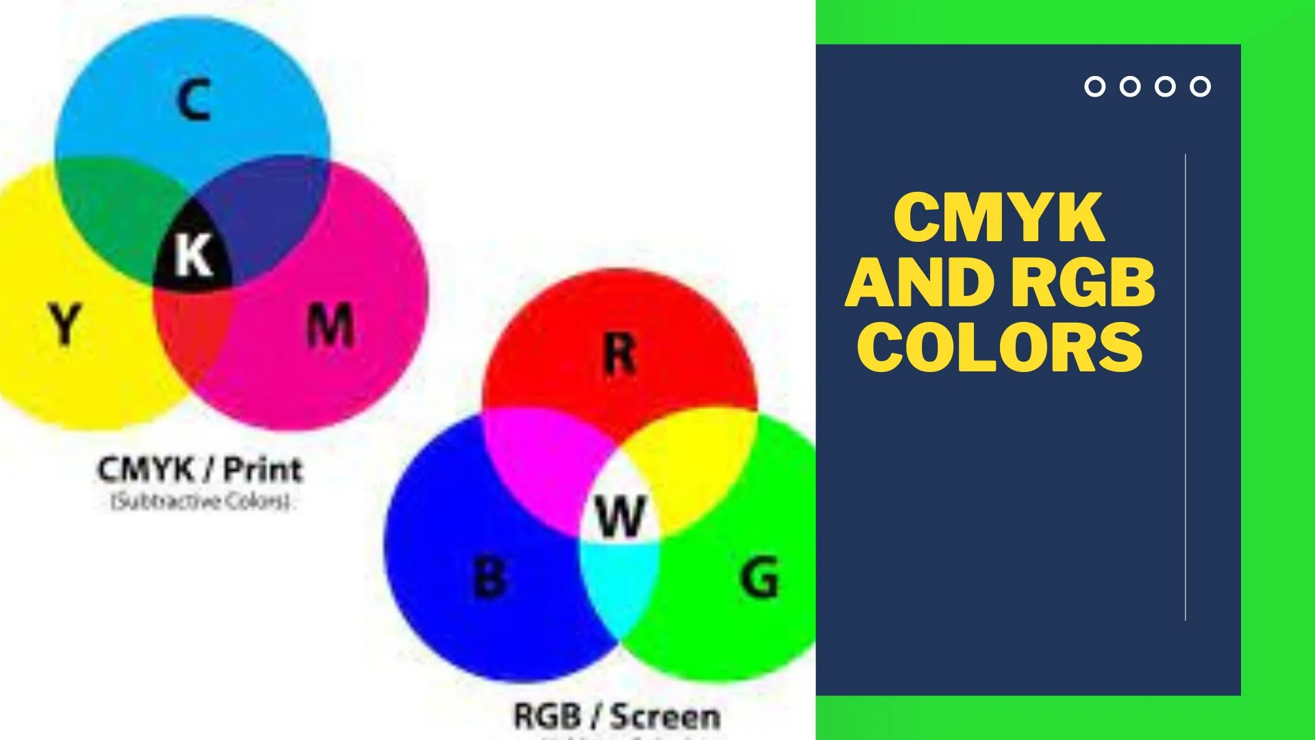
This color mode RGB stands for red, green and blue. These are the color space for digital images. These colors are present behind the screen to which we say digital screen. These color modes are used if your project has to be represented on a screen. The mixture of red, blue and green combines to get you a desired color on your screen based on their varying intensities. The screen you work on has hundreds of pixels behind and each pixel contains sub-pixels: red pixel, a green pixel and blue pixel.
There are 256 levels of each color and these are displayed in a range between 0 to 255.
At first, the screen is black, then red, green and blue lights are added to brighten the screen and create a perfect pigment. For color black, the RGB value is 0. Red= 0 Green= 0 Blue= 0. This means that the complete absence of colors makes the screen black.
Just like black, white color is produced with RGB having its values. In order to create a white screen, the levels of Red Green and Blue should be 255.
255 is the highest-level one-color can get. This means 100% of red and color brings up a maximum presence of light which is white. In RGB the more the color, the lighter the result.
Saturation, vibrancy and modifications of shading is under the control of designer. The designer can manipulate colors on the screen by bringing variations to the percentage of the red and colors depending on what color they want on their screen to be displayed.
RGB is really important to be set and used best if your project has web and app design, social media, visual content and branding. Because a project really needs to be presentable in order to enhance the sales. All these include profile pictures, online logos and ads, icons etc. All the graphics has the vital role of RGB behind which needs to be set as perfect as an astronomical chart. Your project should be as attractive that it grabs a viewer’s attention in milliseconds.
Best File Formats can be Used for RGB
- JPEGs are best for RGB as they are readable almost everywhere is an effective middle ground between file size and quality.
- PSD as it is a standard source file for RGB documents.
- PNG’s as they are better for graphics and contains interface elements like buttons, icons or banners etc.
- GIFs are the motion creating images which moves and give a presentable and effective look to your document. It could be animated as well.
RGB is known as additive mixing.
CMYK
CMYK is the second part of digital printing. C= Cyan (aqua) M= Magenta (pink) Y= Yellow K= key (black). If you want your project to be printed and not to stay within a screen in soft copy, then CMYK is best for you.
The use of black is there in CMYK because the mixture of all other colors cannot create a black color until and unless it doesn’t have a presence of black itself in it. CMYK uses lighter as it absorbs more. This means that more ink will result in more light (the more ink, the darker the result). C, M and Y give a dark brown color. Just like RGB the colors Cyan, Magenta, Yellow, and Black should be 100% in order to create a white color.
The images in the printing machine are created by combining different variations of CMYK colors with physical ink. The mixture of all colors creates a black color. For true black color, Cyan should have a 75% of it, Magnets should be 68%, Yellow should be 67% and Key should be 90%. This will be called “rich black” or “photoshop black”.
As CMYK is a physical print and not viewed on a screen so it is really important that your physical print is impressive as it is also very important with context to packaging.
CMYK is definitely a better option if your project involves branding, advertising or merchandise, as they include billboards, posters, flyers, brochures, t-shirts, hats, pens, mugs etc.
In order to package a product, CMYK is best suited as CMYK has more colors present so it brings more choices for the designer and creates a better colorful design as per his interest and understanding.
Best File Formats for CMYK are:
- PDF’S as they can work for plenty of programs and is very user friendly.
- Al as it is a standard source file for CMYK and multi users can use it in one time.
- EPS as it is better with the vector programs.
CMYK Is Known as Subtractive Mixing
Now if we talk about RGB and CMYK with reference to packaging, it is known that packaging is always tangible. And tangible products need to be impressive enough to attract the customers.
If your project is intended to be printed then you will always go for CMYK and if your project has to be remained within the screen then you prefer RGB.
As CMYK brings more variety of colors, then it is so obvious that CMYK will make your packaging a more impressive one.


