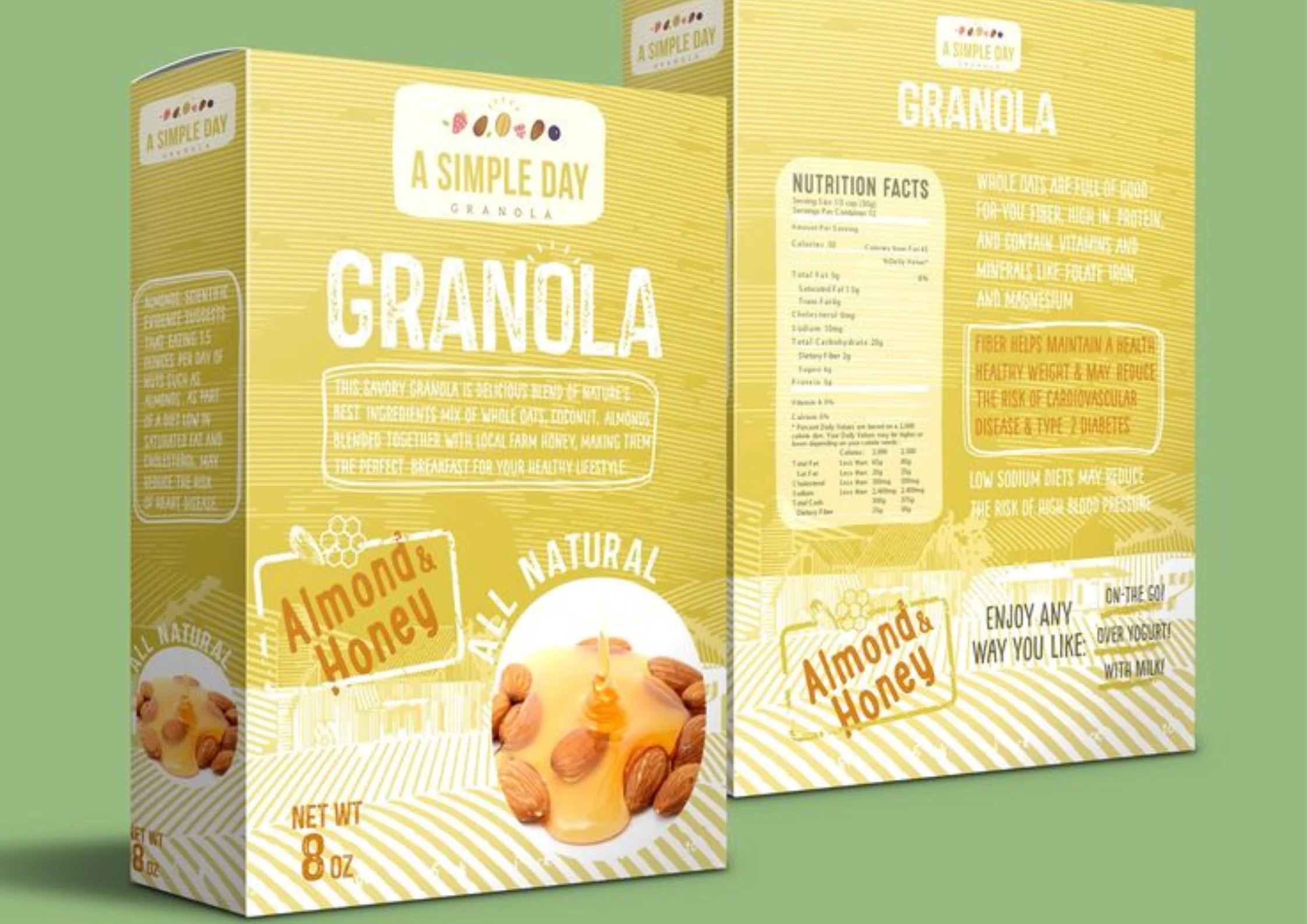
Granola is a snack enjoyed by many. It can be eaten as breakfast or as a snack. The amazing thing about it is that it can be eaten all year round. Many brands are trying their best to make consumers choose their granola. But, before we get into how you can make consumers choose your brand, we must understand what it is that attracts the consumers in the first place. The answer to this important question is the packaging. Packaging is the first thing that a consumer lays their eyes on. If the packaging is nice and clean, then your brand is the one that is going to be picked up. So, to ensure consumers put your brand in their cart, you must give it your all on the packaging.
Why is Packaging Important?
Packaging is the most important thing as it is the first thing a consumer sees. If your packaging is dull, unattractive, and not up to the mark with today’s trends, your brand will not stand out. For your brand to speak to the customer, you must upgrade your packaging and become the best thing a consumer lays eyes on.
Top 10 Ideas for Your Granola to Stand Out
There are a few things that you need to keep in your mind when you select the right packaging for your granola. You must be clear and selective about each, as packaging is everything. The things that you should keep in mind while selecting the packaging are:
Window in Front Packaging
The consumer needs to know beforehand what they are getting. Your packaging should be built to allow a little window in front, making the snacks inside visible. If the consumer sees what they are getting, it will be more convincing for them to get it. Fully-covered granola is hard to sell. Consumers are all about what they can see. For this, incorporate a viewing window to see exactly what they are getting. A viewing window on the pouch lets them know what to expect. Market research shows that consumers are more likely to buy when they can see what they’re buying. This saves them the surprise of opening a package and not liking what is inside.
Freshness Seal
Old granola, i.e., granola that has become stale, is dangerous and can lead to teeth getting cracked. It’s both a waste of money and a waste of food. Granola packaged in tear-off bags is perishable and can be soiled when flipped. On the other hand, packages with a freshness seal preserve freshness and prevent customers from wasting food and money. Zipper pouches lock in flavor and keep the snack delicious for as long as possible and can be a source of increasing consumption. It can be a big selling point.
Multicolor Packaging
This is another great idea to help your product be the best presence on the shelf. If you have more than one flavor of granola, which is usually the case for many brands, then you should do a different style for every flavor. Instead of using the same packaging design for every flavor, you should have a different one.
Different flavors should have different packaging. Instead of having five different flavors in the same package that looks the same except for a small printed line that identifies that flavor and makes them visible, a variety of color packages should be made to suit every taste. Different styles of packaging should create different graphics that reflect their tastes. Creative packaging that reflects flavors so consumers can see and taste the difference can make a big impact.
Convenient Packaging
A box might seem like a good option, but there are better options for freshness. The solution for this is stand-up pouches, especially pouches with re-sealable lids. Standing granola bags can be easily placed on a shelf without taking up too much space and making it easy to scoop and pour the snack. This also removes the hassle of opening the box and having to tape it after use. The added factor of convenience is another attractive point for consumers.
Digital Designs
Another way to attract consumers to put your granola in their carts is by adding graphics and illustrations to your packaging. Having eye-catching digital designs can help attract a consumer from far away. If you have unique designs digitally painted on your packaging, then the product will stand out more compared to brands that do not have such graphics. As a result, your brand will appeal more to the consumer, while the other brand will look bland compared to yours.
Seasonal Packaging
Following trends is a great way to appeal to consumers. One of the best ways to follow trends is by following the seasons. Different seasons bring different things to enjoy and many different kinds of festivities. You can offer limited seasonal flavors with limited packaging designs. This will create new demand for your granola. You can show off your new flavors by adding colors and designs to your packaging that go well with the season in which the flavor is being offered. You can also use designs and illustrations to make your packaging unique. This will ensure that the customer is attracted to your product and will also help in brand recognition.
Earthy colors
Another great idea for your granola packaging is using earthy colors. Earthy colors include colors like brown, green, and skin. These colors have become very popular as of late. Earthy colors are seen as more attractive, practical, and functional, giving the packaging a warm and soothing feel. Many brands from many different industries use these colors to attract consumers. Granola is a healthy snack. To further drive this point home, earthy colors are perfect for granola. Products that have a brown or green color give off an earthy feel, seems more natural, and have a higher appeal. These colors can signify the granola’s healthy nature and convey the brand’s earthy message.
Vibrant Gradients
Vibrant gradations have the potential to captivate consumers. Gradients offer versatility and the ability to create elegant, natural-looking designs by incorporating shadings and placeholders that create something unique or add new energy. Gradients not only add depth, but they also look great in digital format. If we look, most big-name brands have started adopting gradient colors in their designs. Gradients are usually incorporated into packaging by implementing bright and evocative color combinations. Vibrant gradients can be an interesting choice to make your granola stand out and have a shelf presence like no other.
Textured Packaging
Have you ever considered how important it is for consumers to pick up and touch a product when choosing packaging materials and designs? What people feel is as important as what they observe. For example, when you touch the packaging of a luxury product, even for the first time, you can feel its elegant smoothness and the highest quality. It may take time to understand as we might need to realize what our brain is doing at that moment. It is our subconscious that is at work at this time. People thrive on emotional attachment, so touch is a powerful factor in creating that feeling. Therefore, your granola packaging design should have textured packaging to promote tactile sensations or increase product hardness. This is so that consumers are convinced to buy your granola by simply touching the packaging.
Localized Designs
Another amazing idea is to get localized designs on your packaging. You can have localized flavors and localized packaging to go with these flavors. This localized packaged granola will be available in that area only, which can lead to another demand for your granola. Such illustrations may be based on stories describing the history of a particular region, tribal art, or the composition of products associated with the artwork. Illustrations like this always have the potential to be unique and stand out from the market. Residents of that area will be attracted to the granola as they will recognize the illustrations or the meanings behind the packaging. People from other areas will be attracted to the packaging because it is unique and unavailable in other areas. This will make your granola stand out more to locals and visitors.
These top 10 packaging ideas are best to go into 2025 with, as they will ensure that your granola is the best on the shelf and help make your brand consumer’s priority.


